Designing an iOS app:
from idea to functional 📱
An experiment in what a designer can build using Claude Code and SwiftUI, with zero prior Swift experience. Claude Code wrote the code. Xcode ran the builds. The simulator verified the design.
I've been designing mobile apps for years and every single one went through a handoff. I'd write specs, engineers would build it, and that was that. I was curious what it would actually look like to be the one building: not writing Swift myself, but using Claude Code as the heavy lifting tool to generate the code, running builds in Xcode, and using the iOS Simulator to verify the design and interactions.
ShopGenZ was the experiment. A shopping app gave me enough real complexity to actually test the workflow: multiple screens, navigation patterns, cart state, a product grid. I picked the concept, made all the design decisions, and described what I wanted. Claude Code handled the SwiftUI implementation. I ran the builds, checked the simulator, and iterated from there.
This is what that process looked like.
Key Takeaways
- →Claude Code handled all the SwiftUI implementation. My job was to describe what I wanted in design terms and evaluate what came back in the simulator.
- →The simulator is a better design verification tool than I expected. Things that look fine in Figma feel wrong fast when you're actually tapping through them on a phone screen.
- →Describe a change, run the build, check the simulator. That loop was faster and more intuitive than I anticipated.
- →Owning the build process, even as a non-engineer, forces you to make decisions you'd normally leave in a spec. That changed how I write specs.
What I built and why
I needed something with enough real complexity to stress-test the workflow. A shopping app made sense: multiple screens, meaningful navigation decisions, state that needed to persist across views (cart, favorites), different UI patterns, and a product grid. Enough moving parts that if the process broke down, I'd know where.
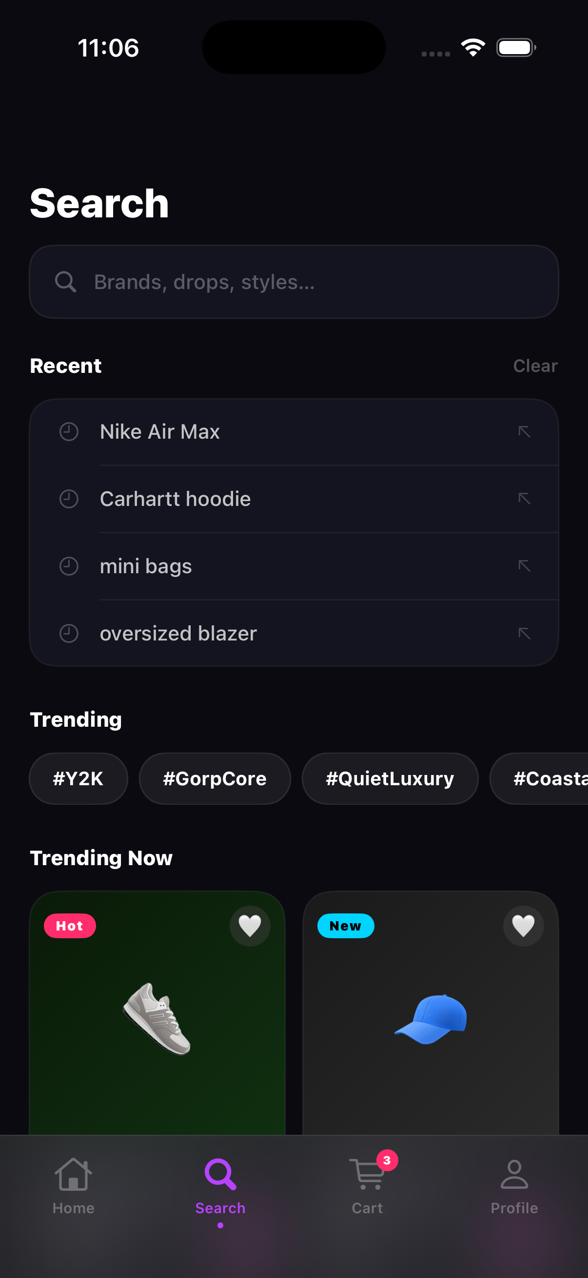
The app ended up with four screens: a home feed, a shop browse view with search and filters, a cart, and a profile page. I gave it a Gen Z aesthetic (dark background, hot pink to purple gradient, electric blue accent) because I wanted it to feel like a real app, not a generic test project. The design choices were still real design choices. There just wasn't a client brief behind them.
The goal wasn't to ship something. It was to find out what you can actually build when Claude Code is doing the heavy lifting and you're focused purely on the design and the decisions.
V1: just get it running
The first goal was simple: get something into the simulator. Not polished, not complete. Just functional. I described what I wanted screen by screen to Claude Code, it generated the SwiftUI, I ran the build in Xcode and checked the result in the simulator. Getting all four screens navigating correctly with a working cart took a few rounds of back and forth, but it got there. Seeing it actually run for the first time was genuinely exciting.
 V1
V1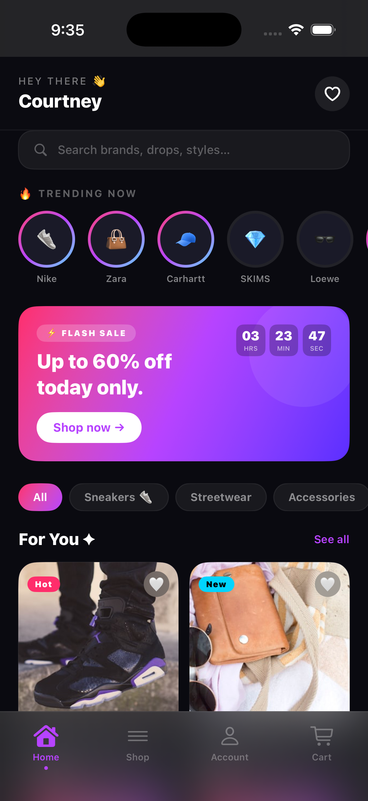 V2
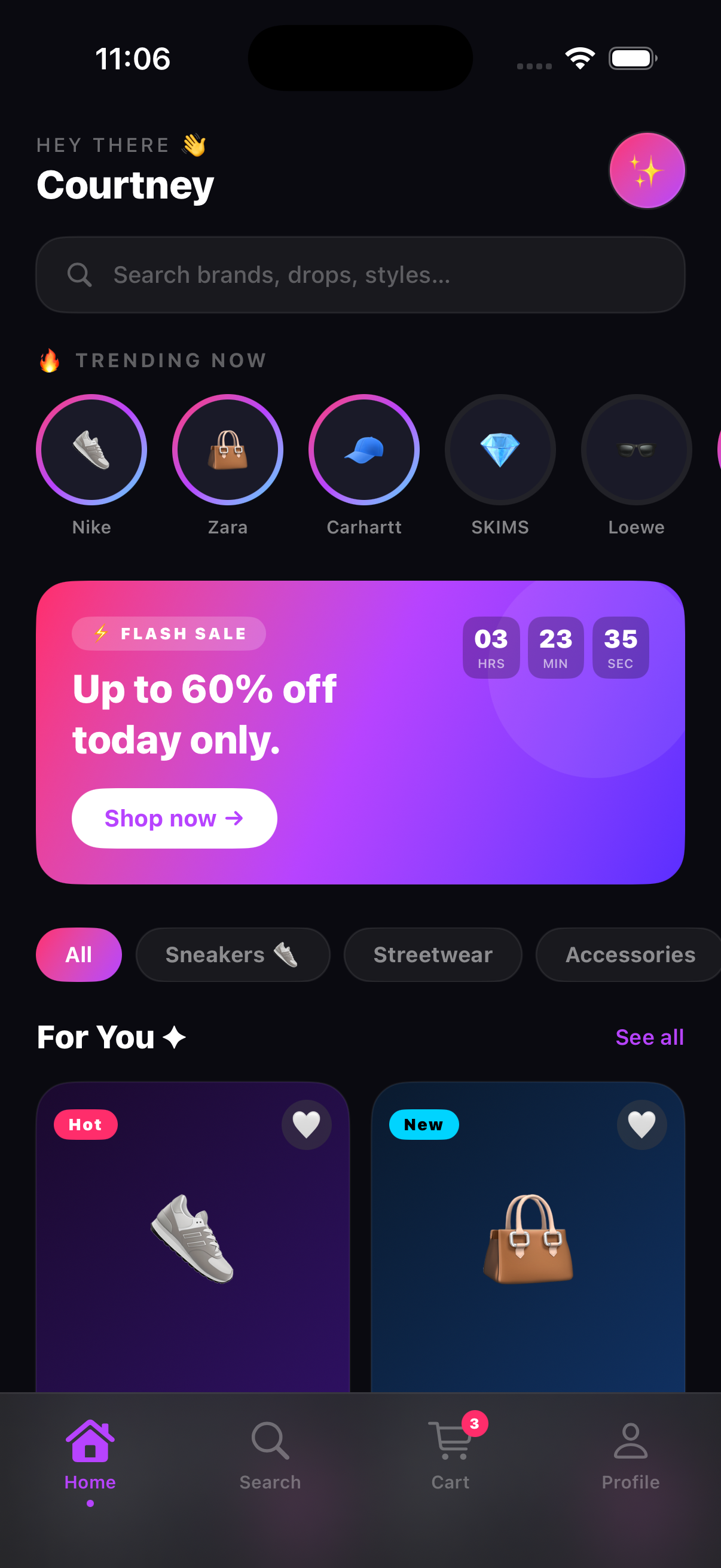
V2V1 used standard NavigationStack push navigation, which is the iOS default. The stories row worked. The flash sale banner with a countdown timer was there. Category filter chips were functional. Product cards used gradient backgrounds with emoji as stand-ins for photography, just to get the layout working without dealing with images yet.
That first build in the simulator was a real milestone. It worked. It was navigable. I could tap through screens, add things to the cart, see the count update. I'd never had that experience with something I'd been involved in building, and it immediately surfaced everything I wanted to change.
 V1
V1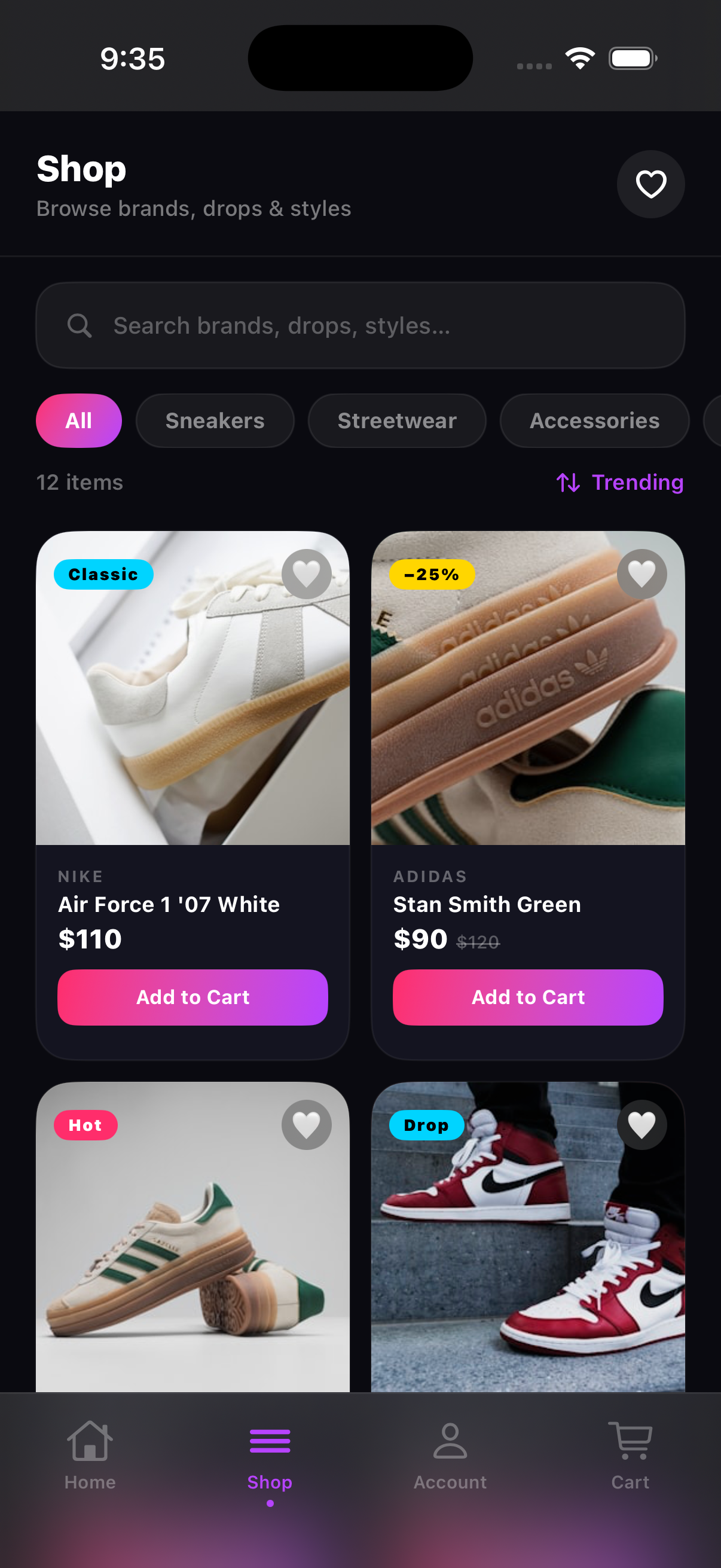 V2
V2What the simulator showed me
This is where the experiment got interesting. Using the simulator to verify the design surfaced things I never would have caught in Figma. The default back-arrow navigation felt generic the moment I was tapping through it on a phone-sized screen. The cart opening as a full page push felt wrong. I've given feedback on both of those things in design reviews before. There's a real difference between noting it on a frame and feeling it in an actual build.
The emoji thumbnails were the clearest example. I knew going in that I'd swap them for real images eventually, but I didn't realize how much they were dragging down the whole aesthetic until I saw the build running. A dark, high-energy color palette with a sneaker emoji on a gradient square reads like a placeholder no matter how polished the rest of the layout is. Real photography wasn't optional. It was structural.
“Using the simulator to verify the design surfaced problems that no Figma preview ever would have.”
That's the part of this workflow I didn't anticipate. The simulator isn't just a place to confirm things look right. It's where you find out what actually needs to change.
V2: iterating from what I saw
V2 came directly from running v1 in the simulator and writing down everything that felt off. Four things made the list. I fixed all four and ran it again.
Real product photography. I swapped in Unsplash images for every product: Nike, Adidas, New Balance, Jordan, Stüssy, SKIMS, Coach, Prada. The difference was immediate. Same card layout, same gradient background colors, but the entire visual register of the app changed. What read as prototype now read as polished.
 V1
V1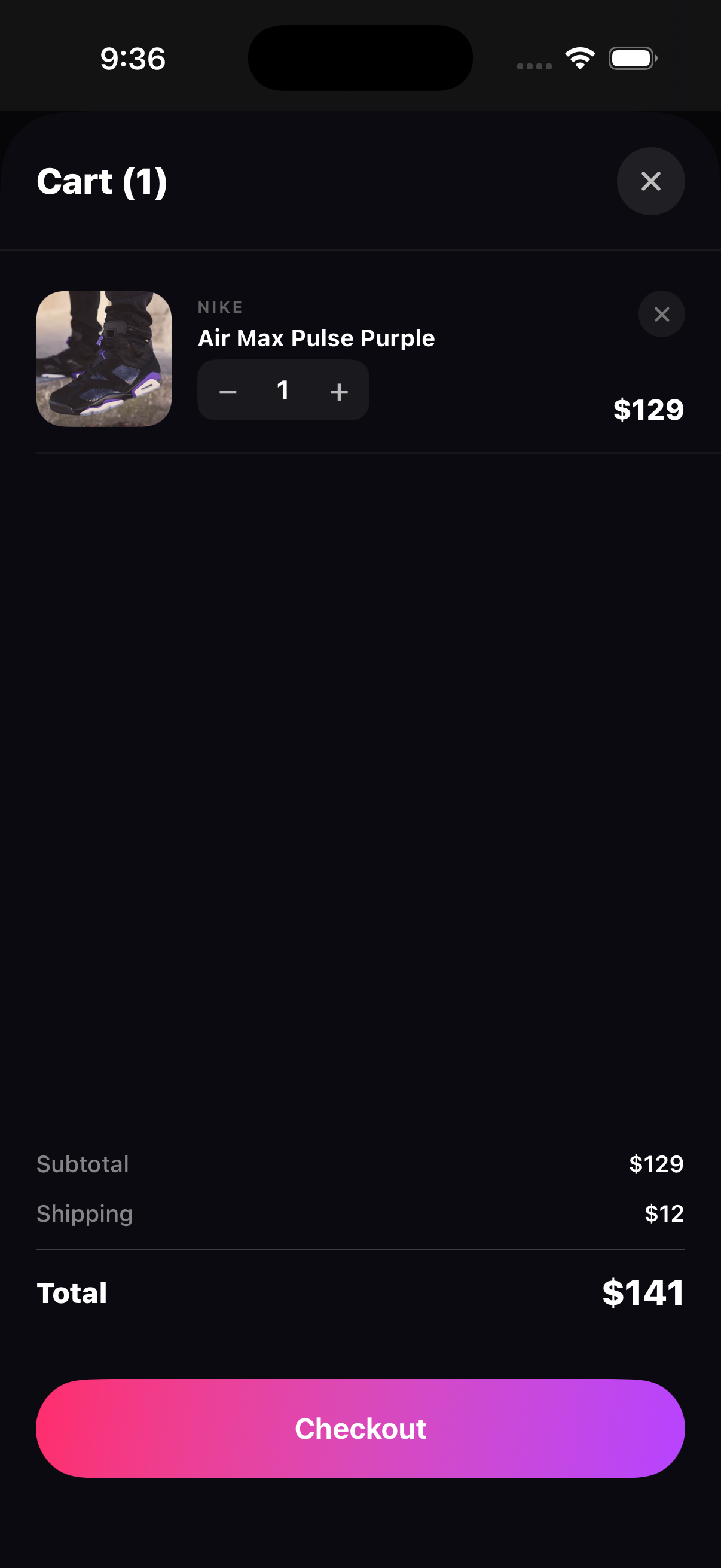 V2
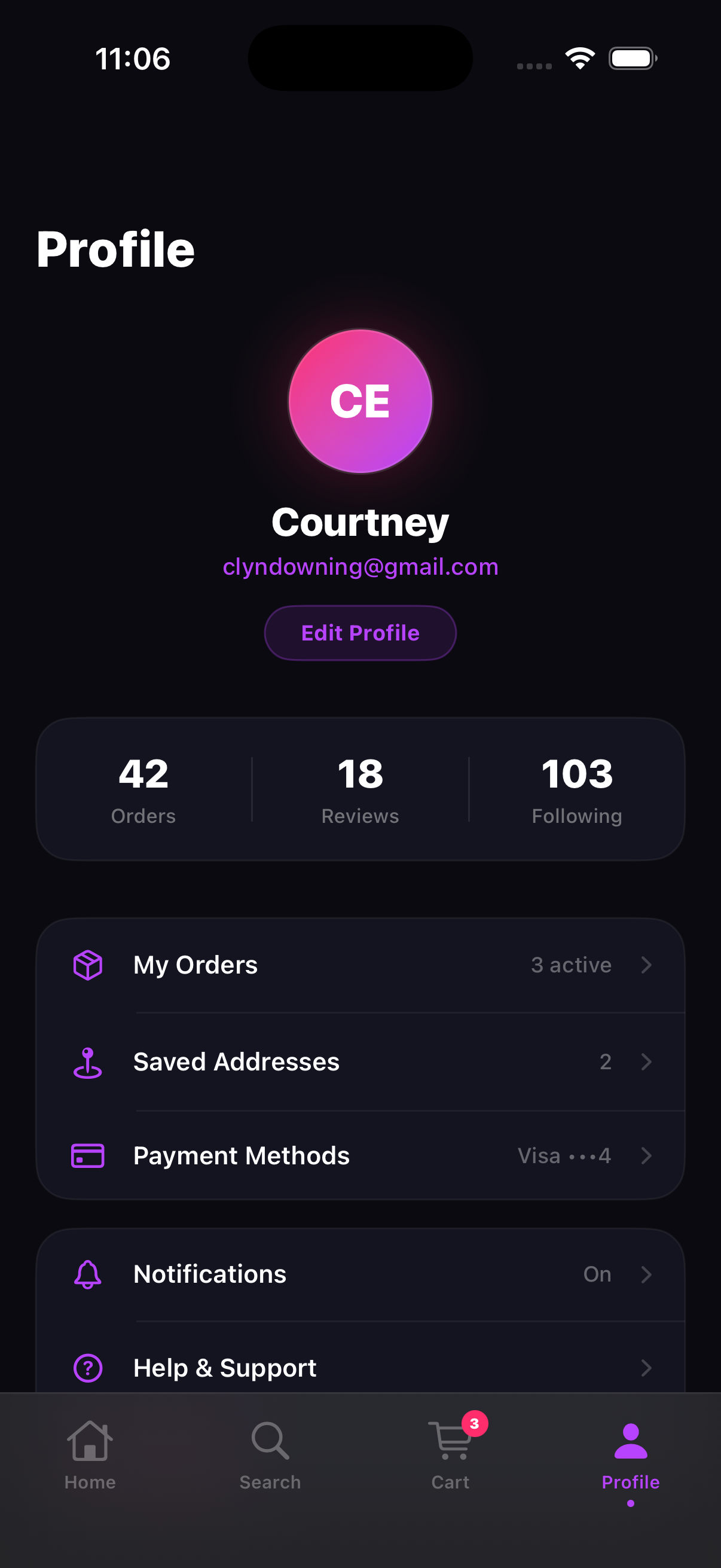
V2Custom sticky headers. I built a StickyHeaderViewcomponent that handles title, subtitle, and action buttons with its own scroll-offset logic. This replaced the default NavigationStack header across the shop and account views. The home screen got a personalized greeting (“HEY THERE 👋 / Courtney”) instead of a back arrow and app name.
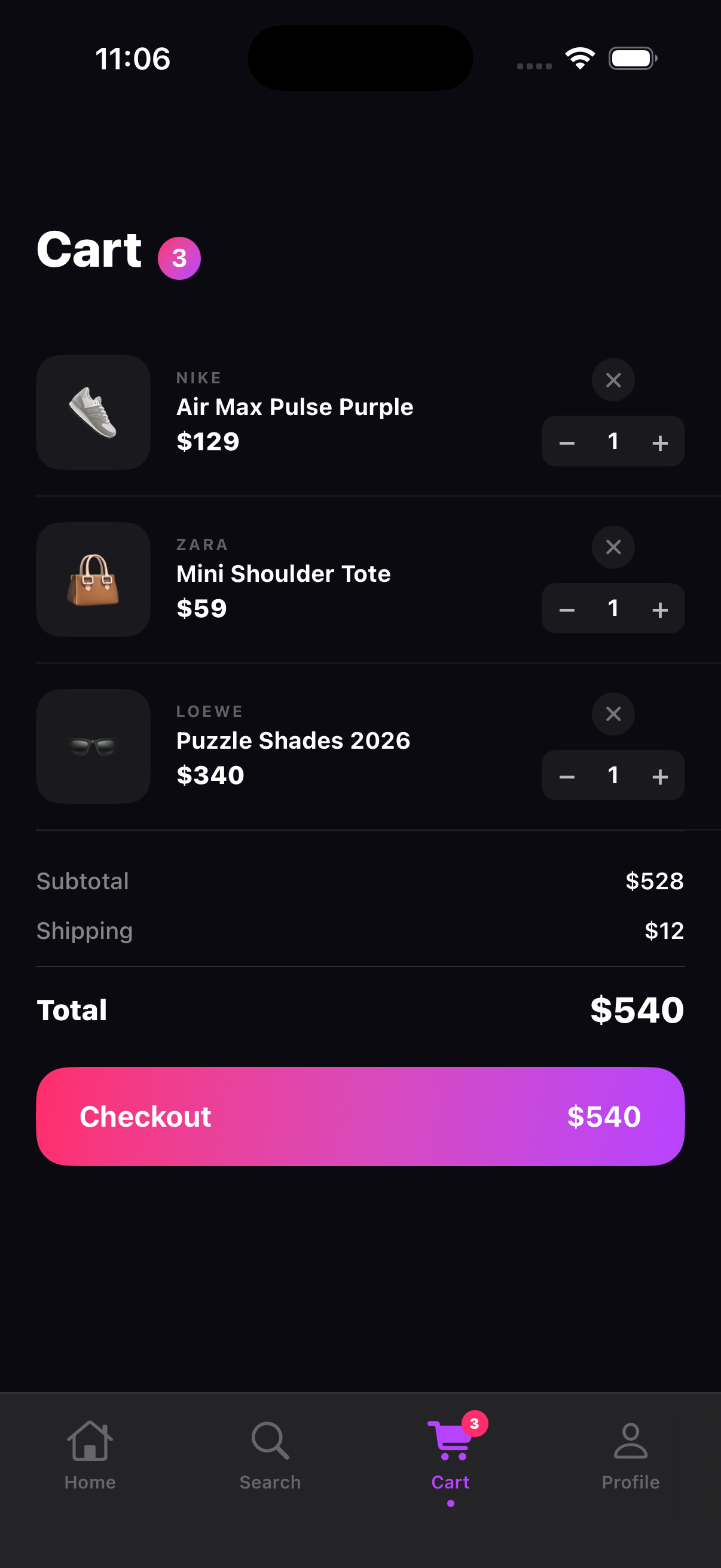
Sheet-based cart. Moving the cart from a navigation push to a .sheet presentation made it feel like a modal checkout rather than another page. Dismissible by gesture, closeable with an X. That pattern lines up with how apps like Depop and GOAT handle their cart.
“Add to Cart” button. The v1 product cards had a small +icon in the corner. V2 replaced it with a full-width “Add to Cart” button at the bottom of each card. More tappable, clearer affordance, and it reinforces the transactional intent of the shop view. A toast notification animates up from the bottom when triggered.
 V1
V1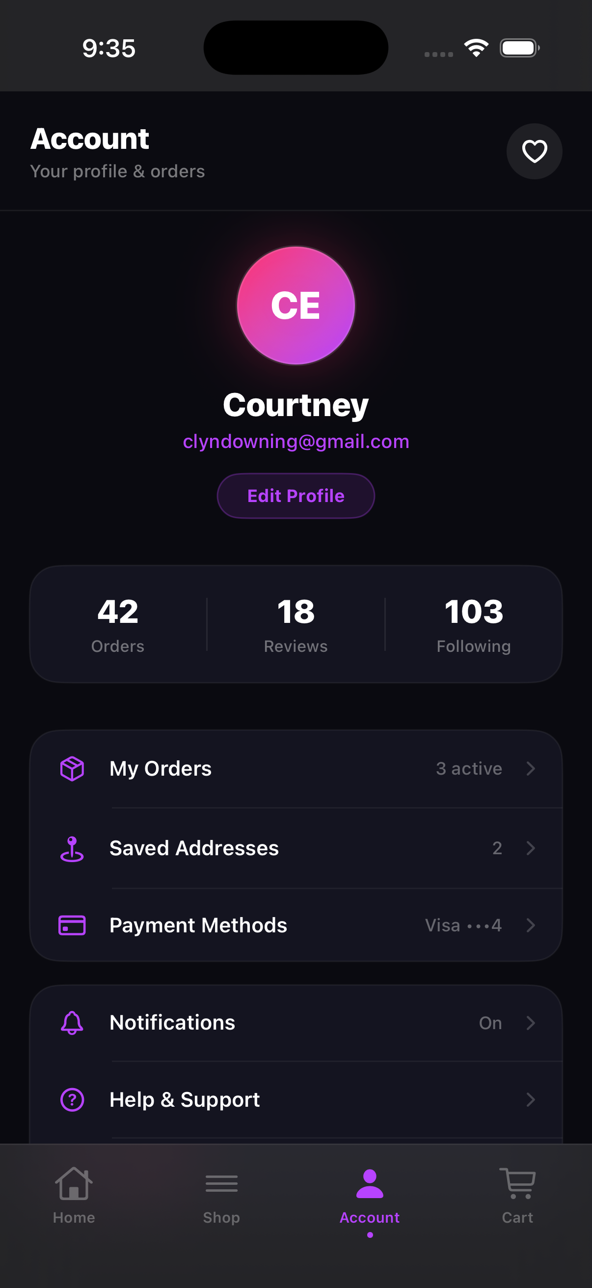 V2
V2What the workflow actually felt like
I had zero Swift experience before this. The workflow was: describe what I wanted in design terms, Claude Code generated the SwiftUI implementation, I ran the build in Xcode, and checked the result in the simulator. If something looked off or felt wrong, I described the problem and ran the build again. That's the whole loop.
SwiftUI was readable enough that I could follow along with what Claude Code was producing even without knowing Swift. The declarative structure maps closely to how I already think about layout: VStack, HStack, ZStack, .padding(), .background(). A VStack is a vertical stack. A ZStack is layering. It clicked faster than React did.
Describe what you want. Claude Code writes the SwiftUI. Run the build in Xcode. Check it in the simulator. Repeat. That's it.
The trickier parts were decisions I'd normally have put in a spec and left for an engineer. Getting CartStore, FavoritesStore, and ToastStoreset up as environment objects that persist across screens: I would've written “cart state should persist globally” in a spec and moved on. Having to actually specify the behavior precisely enough for Claude Code to implement it correctly was a useful forcing function.
The speed was the most surprising thing. Describe a change, run the build, see it in the simulator. That whole loop took minutes, not days. Coming from a world where design changes go through sprint planning and engineering queues, that felt genuinely different.
See it in motion
Side by side: v1 was the first working build, v2 was the redesigned version with the sticky header, toast notifications, fixed cart logic, and real product images.
v1: initial build
v2: redesigned
Details that came from running it, not planning it
Some of the things I'm happiest with in the final version weren't planned. They came from looking at the simulator and reacting to what I saw:
The stories row. Brand stories with an Instagram-style gradient ring border felt right for this audience. Unseen brands get the gradient ring (hot pink to purple to electric blue). Seen brands get a dim ring. That single visual pattern does a lot of work: social platform familiarity, urgency about new content, and a clear sense of what you've already seen. All without any text.
Per-product gradient backgrounds. Each product card has its own background gradient pulled from the brand's color language: dark navy for Nike, forest green for Adidas, deep red for Jordan. The Unsplash product photo sits on top. This creates a visual identity per card that makes the grid feel curated rather than uniform.
The scroll offset system. Getting the header to respond to scroll required a PreferenceKey that measures the scroll container's position and passes it back up to the parent. It's a non-obvious SwiftUI pattern, but once I understood it, it was clean. It's the same approach used across the home, shop, and account views, all passing scrollOffset up to a shared header component.
The stories row does the most design work per pixel of any element in the app. Gradient ring = unseen. Dim ring = seen. No text needed.
What I actually got out of this
The experiment worked. Claude Code handled all the SwiftUI. I never had to write Swift myself. Running builds in Xcode and verifying in the simulator gave me a feedback loop I'd never had before as a designer. And it was fast. The gap between “I want this to feel different” and “it actually does feel different” was minutes, not weeks.
The bigger thing I took away: when you own the build process, you can't leave anything vague. I'm used to writing specs that say things like “cart state persists globally” or “navigation feels native.” Claude Code needs to know exactly what that means to implement it correctly. That specificity made me realize how much ambiguity I'd been handing off without noticing. A 2025 CollabSoft survey of 500 designers found 52% describe developer implementations as merely “good enough,” with only 21% arriving pixel-perfect (CollabSoft, 2025). A lot of that gap starts in the spec.
“Navigation architecture is a design decision, not an engineering one. Running the builds myself made that obvious in a way ten years of handoffs hadn't.”
That same survey found 39% of designers say the best fix for collaboration is mutual skill-building: designers learning code, developers learning design (CollabSoft, 2025). This was one version of that.
ShopGenZ isn't a product. It's a working app that came out of an experiment in what's possible with Claude Code and SwiftUI. If you're a designer curious about this workflow, the honest answer is: it's more accessible than it looks, Claude Code does the heavy lifting, and the simulator is a much better design verification tool than I expected.
Frequently asked questions
Do you need to know Swift or Xcode to do this?
No. I had zero Swift experience before starting this. Claude Code wrote all the SwiftUI. My role was to describe what I wanted, run the builds in Xcode, and use the simulator to verify the design. You don't need to write code. You need to be able to describe what you want clearly enough for Claude Code to implement it.
How long did v1 to v2 actually take?
V1 took a few sessions to get all four screens working with functional state. The v2 iteration (photography, navigation rebuild, sheet-based cart) was another couple of sessions. Short focused rounds with the simulator open the whole time were the right approach.
Is the simulator actually useful for verifying design?
Way more than I expected. Things that look fine in a Figma frame feel wrong immediately when you're tapping through them on a phone-sized screen. Navigation patterns especially. I caught issues in the simulator that I would have shipped in a handoff without noticing.
What was the hardest part of the process?
Getting the sticky header to respond to scroll. SwiftUI doesn't expose scroll position directly. Claude Code used a PreferenceKey with a GeometryReader to measure and pass the position up the view hierarchy. I had to verify the behavior in the simulator a few times before it felt right.
Would you recommend this workflow to other designers?
Yes. You don't need to know how to code. Claude Code handles that. Pick something real enough to be worth building, describe it clearly, run the builds in Xcode, and use the simulator to verify. The loop is fast, the feedback is immediate, and you'll learn more about how your designs actually work than any amount of Figma prototyping.