Case Study · Mobile · 2022
Item Level Fulfillment
Designing flexible fulfillment for a feature that never shipped — and why that still matters.
Role
Product Designer
Company
American Eagle Outfitters
Platform
iOS & Android
Tools
Axure · Sketch
Overview
The opportunity
AE and Aerie app customers had one choice when it came to fulfillment: ship everything or pick everything up in store. There was no in-between. If you wanted one item delivered and another ready for pickup, you placed two separate orders. It was a clunky workaround for a genuinely common shopping scenario.
I led the design effort to change that, working through multiple rounds of concept design, competitive analysis, and unmoderated usability research across iOS and Android. The project was complicated by constantly shifting engineering constraints, and it is one of the clearest examples I have of doing thorough design work under uncertainty.
The Problem
One order, one fulfillment option. Customers wanted more.
The limitation was straightforward: the order management system treated every order as a single fulfillment unit. Customers who wanted some items shipped and others picked up had no way to do it in one transaction. They either split the order manually or settled for one option.
Industry terminology: mixed cart fulfillment
This scenario has an industry name. Mixed cart fulfillment refers specifically to orders where a customer wants part of their cart picked up in store and the rest delivered to their home. It requires the OMS to route a single transaction to two different fulfillment nodes simultaneously, which is where the complexity lives.
All-or-nothing fulfillment
Ship everything or pick everything up, with no middle ground for customers who wanted both in a single transaction.
High-value segment underserved
Omnichannel shoppers tend to have higher lifetime value. Competitors were beginning to offer more checkout flexibility.
No predefined success metrics
Leadership identified this as a missed opportunity, not an active complaint. Figuring out what good looked like was part of the work.
Problem Statement
“How might we give AE + Aerie app shoppers the ability to choose different fulfillment methods for individual items in a single order — without introducing confusion or friction at a high-stakes moment in the purchase flow?”
Strategy
Make the problem testable before committing to a direction.
With undefined metrics and significant engineering unknowns on the backend, the priority was finding the fastest path to a meaningful signal rather than designing toward a fully specced solution.
Signal over specification
Design enough to test the concept meaningfully, not enough to over-invest in an unvalidated direction.
Per-item selection in cart
Customers choose fulfillment per item directly within the cart, where they already have full context about what they're buying.
Split order clarity at checkout
Checkout presents two fulfillment groups with separate timing and totals, with no ambiguity about what's going where or what it costs.
A known cost tradeoff, understood going in
Mixed cart fulfillment is a known cost pressure for retailers: splitting an order into multiple fulfillment streams can double the cost of fulfillment per transaction. That tradeoff was understood from the start. The intention was to validate customer value before the business committed to absorbing it at scale. Building a high-fidelity prototype, rather than the real backend, was the deliberate choice: polished enough to produce authentic reactions in unmoderated testing, without committing engineering to the OMS work before we knew if the idea held up.
The Concept
What customers actually saw in testing.
Two different interaction patterns were prototyped for choosing fulfillment per item in the bag, then tested against each other. Checkout confirmed the split clearly either way, with pickup and delivery groups shown separately with their own timelines.
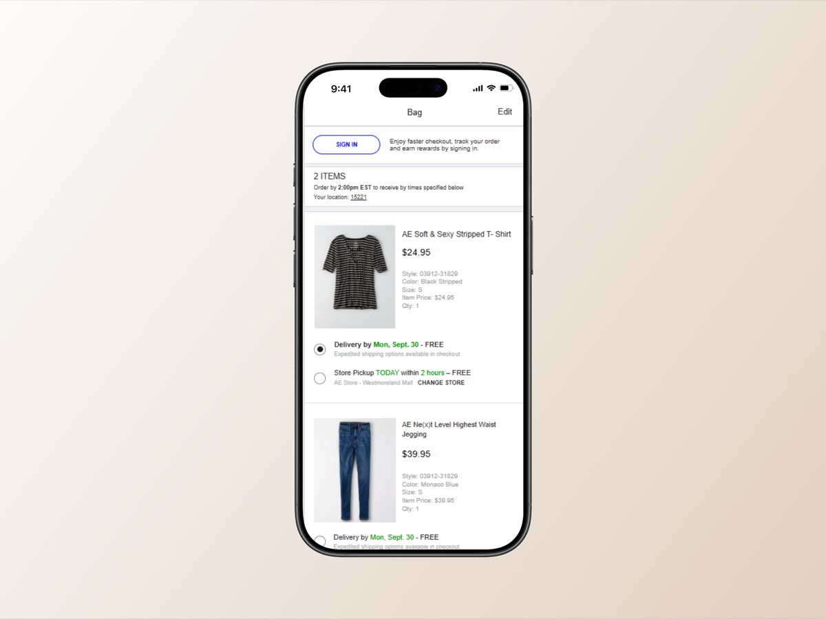
Fulfillment choices shown inline in the bag: delivery and same-day store pickup as radio options directly under each item.
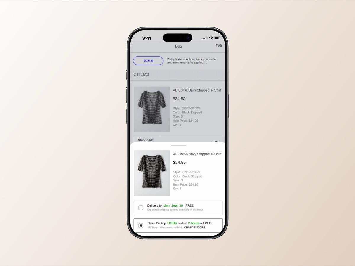
Fulfillment choices moved into a bottom sheet, tapped open per item, keeping the main bag list uncluttered.
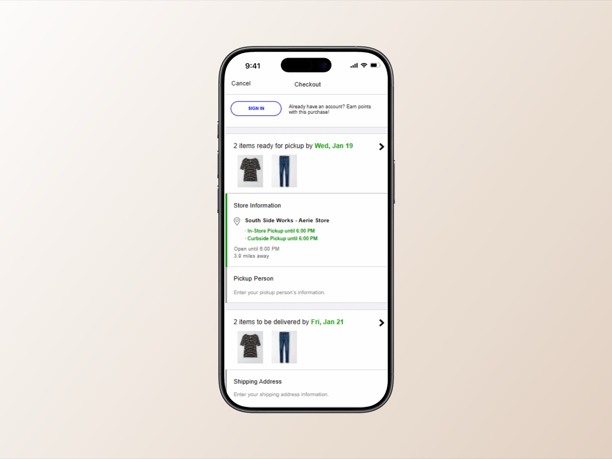
Checkout groups items by fulfillment method, showing pickup details and delivery timing as two distinct, clearly labeled groups.
Design Process
Iterating toward something testable.
What made this project genuinely difficult was that the constraints kept moving. Engineering discoveries were surfacing new limitations in the OMS, and product requirements shifted as the team learned more about what was technically feasible. Every design review had the potential to reframe what we were actually building.
Design work under shifting constraints
A significant portion of the design work was not about refining pixels. It was about adapting quickly, re-evaluating decisions that had already been made, and finding ways to preserve the core customer experience as the boundaries of the possible kept narrowing. Some solutions we had designed around became unavailable mid-process. Others required full rethinks of how the cart interaction worked.
Holding design reviews consistently with product managers and engineers was what kept the work from going sideways. When a constraint changed, we caught it early and adjusted rather than discovering it at the end.
Competitive analysis
Analyzed best-in-class fulfillment experiences and how competitors handled per-item selection, split orders, and checkout communication.
BOPIS usage pattern review
Reviewed existing Buy Online, Pick Up In Store data to understand how AE customers were already using partial fulfillment and where expectations were being set.
Iterative design reviews with product and engineering
Regular cycles with product managers and engineers as backend constraints shifted. Designs adapted continuously, never locked in before constraints were fully understood.
iOS & Android prototype development
Built testable prototypes for both platforms in Axure and Sketch, updated after each review cycle to reflect the latest state of what was actually buildable.
Unmoderated remote usability testing
Wrote a test script and ran unmoderated remote sessions. Participants were given tasks mirroring a real mixed-fulfillment scenario: some items available to ship, others only available for pickup nearby.
Usability Research
What the research surfaced
Testing surfaced a clear split in how people responded to the concept. That split turned out to be one of the more useful findings of the whole project.
An industry-documented friction point: Split fulfillment is widely considered one of the hardest checkout experiences to communicate clearly. First exposure to a split-order UI is a known friction point across retail, making it important to distinguish concept comprehension issues from fundamental concept rejection.
What resonated
BOPIS-familiar customers clicked
Customers who were already familiar with BOPIS picked up the concept quickly and found it genuinely useful. Not a workaround, a real benefit.
Speed + flexibility combination appealed
Getting certain items faster through pickup while having others shipped was framed as a real benefit, not a compromise.
Visual separation felt intuitive
When the ship and pickup groups were clearly separated visually, the layout felt intuitive rather than confusing.
What needed work
First-time exposure caused hesitation
First-time exposure to a split-order checkout caused hesitation. People slowed down, re-read, and sometimes backed out.
Fulfillment control discoverability
The per-item fulfillment control was easy to miss. Some participants did not realize they could change it at all.
Cognitive overload at checkout
The checkout screen showing two separate fulfillment groups felt like a lot to process, especially on a small screen.
Reading the results correctly
The split in user reactions was not a sign that the idea was broken. It pointed to a viable feature that needed better communication design, not a fundamentally different approach. BOPIS-familiar customers got it immediately. First-timers needed more framing at the entry point. That gap was a map of what to fix next.
Outcomes
A project that didn't ship, and what it produced.
The project was cancelled. The work mattered regardless. Here is a direct account of why.
Why the project was cancelled
The project was cancelled due to backend complexity that substantially exceeded initial scoping estimates. Supporting item-level fulfillment required changes to the order management system that were significantly larger than anticipated when the project kicked off. Mixed cart fulfillment requires the OMS to route a single transaction to two separate fulfillment nodes, and doing that at scale compounds quickly.
Per-item routing required changes to the OMS far larger than initial estimates
Each split order adds picking, packing, handling, and shipping costs, doubling per-order fulfillment cost
Backend lift combined with the cost model made the business case harder to justify
Organizational priorities shifted, and the feature was removed from the roadmap
A validated concept with a clear comprehension problem
The split in user reactions was not a sign that the idea was broken. It pointed to a viable feature that needed better communication design, not a fundamentally different approach. That is a meaningful finding even without a launch.
Specific design direction for a future attempt
The research surfaced exactly where the UI fell short: the per-item fulfillment control needed more visibility, and the split checkout screen needed a lighter cognitive load. That is a ready brief for Phase 2 if the backend work ever becomes feasible.
Real organizational knowledge
The project surfaced how much backend lift mixed fulfillment actually required. That information changed how engineering and product evaluated similar features going forward.
Reflection
What I carried forward
Not all good design gets built
“That is worth saying out loud rather than treating as a failure. Good research in a cancelled project still moves the organization's understanding forward.”
Engineering needs to be in the room earlier
“If engineering had been involved in discovery, the team would have had a clearer picture of the backend lift before significant design investment was made. That is a process lesson I brought into every subsequent project.”
Mixed test results are still results
“The split in comprehension was informative, not ambiguous. Knowing that the concept worked for some users and caused hesitation in others is directionally useful. It tells you what to fix, not that you should stop.”