Case Study · Mobile Design · 2024
App Product Reviews Redesign
End-to-end redesign of the product reviews experience in the AE + Aerie mobile app, rebuilding photo carousels, submission flows, and review UI to turn a fragmented section into a high-trust content engine.
Role
Product Designer
Company
American Eagle Outfitters
Platform
iOS & Android
Tools
Figma · Axure · Miro
Context
The opportunity
A vendor API migration created a rare blank-slate opportunity: rebuild the entire AE + Aerie mobile app reviews experience from scratch rather than patch an aging system. I led design end-to-end, collaborating with product management on scoping, research execution, and handoff.
The Problem
Fragmented, friction-heavy, and visually flat
The existing reviews experience failed shoppers in three connected ways, each mapping to documented industry failure modes.
Fragmented interactions
Inconsistent UX patterns across PDP, review detail, and submission
Hidden customer photos
UGC imagery buried below the fold with no surfacing strategy
High submission friction
Five-step web form causing abandonment on mobile
The old form: five steps before you could submit
1
Your Review
2
Add Images
3
Personal/Product Information
4
Product Rating
5
Brand Details
Problem Statement
“How might we redesign the AE + Aerie reviews experience so that shoppers can quickly find relevant content, engage with real customer photos, and write reviews with as little friction as possible, building the kind of purchase confidence that drives conversion?”
Research
Reviews are a primary purchase driver
User behavior data and industry benchmarking confirmed the stakes and revealed clear gaps worth closing.
0%
of clothing shoppers read reviews before buying
0%
consider reviews a key purchase factor
0%
specifically seek customer photos before buying
0%
higher conversion for products with reviews
Top considerations when purchasing clothing
Sources: PowerReviews 2023, SHEIN Global Survey, FitSmallBusiness 2025
Price
83%Reviews validate worth relative to cost
Return Policy
80%Reviews mentioning returns influence purchase
Ratings & Reviews
77%Central to apparel purchase decisions
Fit & Sizing Info
67%Top return reason; reviews address sizing accuracy
Customer Photos
59%Shows product on real people vs. studio photography
Personal Style
58%Shoppers verify expectations through reviews
Industry gap: Baymard Institute
78% of mobile e-commerce sites offer poor to mediocre review filtering. Fit context (height, size purchased, fit rating) was almost universally absent, despite being the top return driver in apparel.
User Research
Unmoderated remote user interviews
To study natural behavior rather than task completion, I ran unmoderated remote interviews with existing AE and Aerie app users, observing how they actually navigated the reviews surface, what they were looking for, and where they dropped off.
What we observed
Size & body type discovery gap
No easy mechanism to locate reviews from similar body types or sizes, despite it being essential information for apparel purchase decisions.
Photo underutilization
Customer photos were underused because they were difficult to discover and browse. Shoppers didn't realize they existed.
Submission flow mismatch
The flow felt like a web form inside a native app. It didn't match expected swipe gestures or familiar device patterns.
Filtering limitations
Sorting and filtering options were too limited to help users eliminate irrelevant reviews and surface what actually mattered to them.
Aligned with industry research:Findings matched closely with Baymard Institute's large-scale usability testing, which consistently identifies limited filtering, buried visual content, and non-native submission flows as the most common review UX failure modes in mobile e-commerce.
Competitive Analysis
Benchmarking 11 retail apps
I analyzed reviews experiences across leading retail apps including Abercrombie & Fitch, Nordstrom, Urban Outfitters, Gap, Lululemon, Nike, Victoria's Secret, Macy's, Sephora, Target, and Walmart, benchmarking PDP display, filtering, photo UGC treatment, and submission flows.
Nordstrom
Richest reviews surface: tappable star-tier bars, inline search, PROS/CONS topic chips
Macy's
Most multi-dimensional fit section with three separate sliders: silhouette, size, and length
Gap
AI-generated sentiment summary with structured Likes, Mixed, Dislikes tags. Since adopted by 6 of 11 competitors.
| Feature |  |  |  |  |  |  |  |  |  |  |  |
|---|---|---|---|---|---|---|---|---|---|---|---|
| PDP — Reviews Surface | |||||||||||
| Star rating on PDP | |||||||||||
| Fit indicator on PDP | slider | — | slider | — | slider | text label | text label | — | — | — | — |
| Customer photos on PDP | — | — | — | — | — | — | |||||
| Review preview cards on PDP | — | — | — | — | — | — | — | ||||
| Write a Review CTA on PDP | — | — | full-width | — | — | — | — | — | — | ||
| AI-generated summary on PDP | — | — | — | — | — | — | — | ||||
| Q&A section on PDP | — | — | — | — | — | — | — | — | — | unique | — |
| AI shopping assistant on PDP | — | — | — | — | — | — | — | — | — | unique | — |
| Reviews Page — Summary & Filters | |||||||||||
| Star breakdown bars | raw counts | % | — | — | filterable | filterable | % | % | % | % | % + count |
| AI summary — reviews page | — | Likes/Mixed/
Dislikes chips | — | — | — | — | — | bulleted prose | +/− icon chips | prose + red
accent border | tappable
topic bullets |
| Pros / Cons topic chips | — | — | — | + pull quotes | — | — | — | color-coded
icon chips | — | ||
| Attribute filters | — | — | — | — | age, ht,
style, band | star tier
chips | rating,
verified | — | star, verified,
+ topic chips | ||
| Search reviews | topics +
reviews | — | — | — | — | — | — | — | — | — | |
| Multi-dimensional fit sliders | fit + quality | — | — | fit + comfort | — | — | — | slim / fit /
length — 3 | — | — | — |
| Multi-attribute score summary | — | — | — | — | — | — | fit, quality,
comfort | — | — | 5 circle badges | — |
| Reviews Page — Individual Review Cards | |||||||||||
| Reviewer body metadata | wt, ht,
size purch. | height only | size purch. | — | ht, wt,
color, fit | ht, age,
size, location | fit, breast
shape, age, ht | height only | hair type,
hair color | — | color, length,
clothing size |
| Verified purchase badge | — | — | — | — | — | ||||||
| Helpful voting | — | — | — | — | count visible | — | — | ||||
| Photos embedded in review cards | — | — | — | — | — | — | — | — | — | ||
| Brand response to reviews | — | — | unique | — | — | — | — | — | — | — | — |
| Recommendation percentage | 72% | — | — | — | — | — | — | — | 81% | — | — |
| Promo / incentivized disclosure | — | — | — | — | — | — | — | incl. in
AI summary | — | ||
| Syndicated source disclosure | — | — | — | — | — | — | — | Originally
posted on… | Originally
posted on… | — | — |
| Top Reviewer / community badge | — | — | Sweat
Collective | — | — | — | — | — | — | — | Top Reviewer
blue star |
| Ratings vs. reviews count separated | — | — | — | — | — | — | — | — | — | — | unique |
Clear opportunity identified
Only 2 of 11 competitors offered review search. And no competitor had built a truly photo-forward carousel experience, making it a clear differentiation opportunity for AE + Aerie.
Design Principles
Three north stars
Discoverability
Relevant reviews should rise to the top. Filtering, sorting, and hierarchy should do the heavy lifting so shoppers don't have to.
Visual Richness
Customer photos are first-class content and should be treated that way: easy to find, easy to browse, and easy to submit.
Submission Ease
Writing a review should feel native and fast. Every step of friction removed is a potential review gained.
Solutions
What we built
Four connected improvements, each grounded in user research findings and documented industry best practices.
Enriched Photo Carousels
Customer photos elevated into a prominent, swipeable carousel on the PDP. No competitor had built a truly photo-forward experience, making this a clear differentiation opportunity. Submission flow updated to explicitly prompt photo uploads at the right moment.
Expanded Review Sheet
Individual reviews restructured with better typography, breathing room, and fit context metadata: size purchased, fit rating, and verified purchase status surfaced alongside the review body. Helps shoppers self-select without guesswork.
Native Write a Review Flow
Rebuilt from scratch as a fully native iOS and Android flow with single-screen layouts, native input components, and gesture patterns that match device conventions. Replaced the five-step web form (Your Review, Add Images, Personal/Product Information, Product Rating, Brand Details) that was causing abandonment.
Enhanced Filtering & Sorting
New controls for rating, recency, photo availability, and fit attributes. Directly addressing the Baymard finding that 78% of mobile e-commerce sites offer poor filtering. Well-implemented filters increase conversion by 26%, yet only 16% of major sites provide genuinely good filtering.
Final Screens
What shipped
Four connected surfaces, each addressing a distinct gap identified in research.
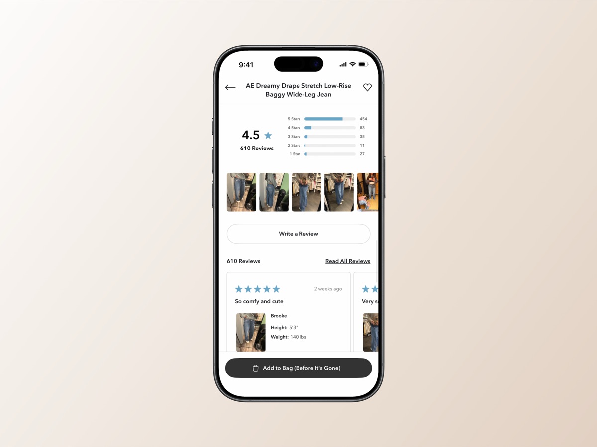
Enriched photo carousels on PDP
Customer photos elevated into a prominent carousel with star distribution, review count, and inline review cards, all within the product detail page.
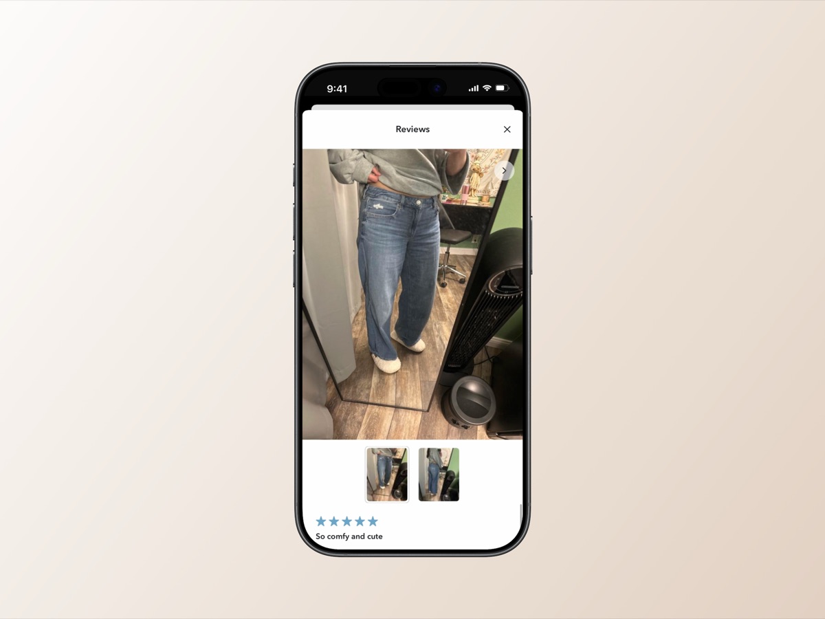
Full-screen review sheet
Tapping a review card on the PDP opens a full-screen sheet with the complete review: star rating, fit context, body, and photos, giving shoppers all the detail they need without leaving the product page.
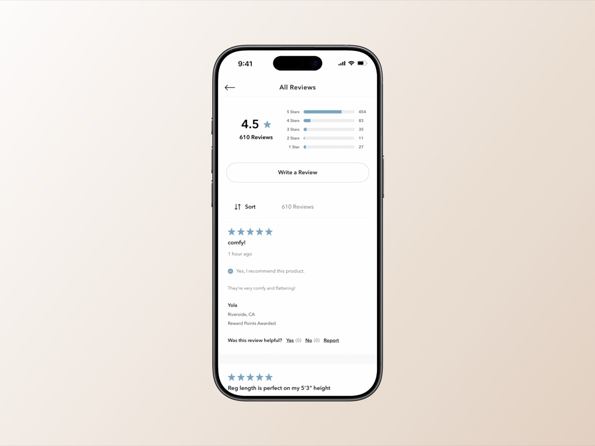
All Reviews list with sort & fit context
Dedicated reviews screen with sort controls, star breakdown, and individual review cards surfacing fit attributes and reward points disclosure.
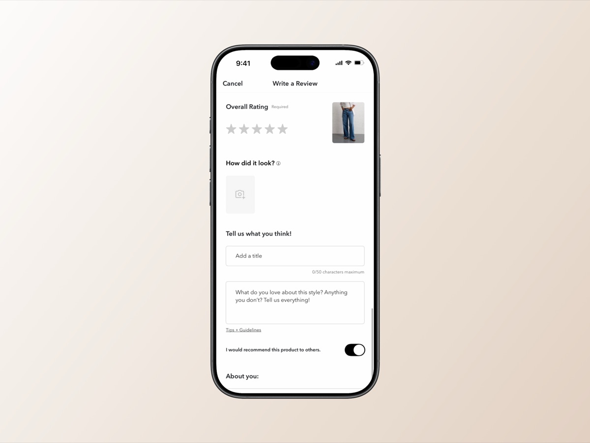
Native Write a Review flow
Rebuilt as a fully native form with star rating, photo upload, title, body, and recommendation toggle, replacing the old five-step web form that was causing abandonment.
Accessibility — built in, not bolted on
WCAG 2.X AA compliance was a first-class requirement from the first wireframe, not a final QA checklist item. Every touch target, color contrast pairing, and screen reader interaction was considered throughout the process.
Touch target sizing requirements met throughout
Color contrast specifications followed across all states
Screen reader-compatible component patterns
Focus management within review sheet and submission flow
Star rating displays readable by screen readers, not purely visual
Interactive elements meet minimum touch target sizing
Outcomes
Results
Improved content discoverability
Restructured hierarchy surfaced relevant reviews and photos without deep navigation
2x review form submission rate
Native flow replaced web-form patterns, directly reducing abandonment
Increased photo UGC volume
First-class photo prompts in submission drove more visual content
Greater session engagement
Richer content gave shoppers more reason to explore before purchase
WCAG 2.X AA compliance
Accessibility baked in from the start, not bolted on at QA
Stronger purchase confidence
Closed the gap between what shoppers needed and what the experience delivered
Reflection
Key learnings
On forced migrations
“Forced migrations are rarely just migrations. The API update created alignment and urgency that can be hard to manufacture for experience improvements on their own, and the team made good use of that window to address debt that had been building for a while.”
On the research approach
“The unmoderated research approach was the right call for this problem. Because we were studying navigation and discovery behavior rather than task completion, watching users in their natural context surfaced patterns that a moderated session might have smoothed over.”
On the submission flow
“The biggest design challenge was the submission flow. Rebuilding it as a fully native experience required early, honest conversations with engineering about what was feasible. Those conversations shaped the scope in ways that made the final handoff much cleaner.”